Introducing ‘Brandon brings you back’
Advertisement
Read this article for free:
or
Already have an account? Log in here »
We need your support!
Local journalism needs your support!
As we navigate through unprecedented times, our journalists are working harder than ever to bring you the latest local updates to keep you safe and informed.
Now, more than ever, we need your support.
Starting at $15.99 plus taxes every four weeks you can access your Brandon Sun online and full access to all content as it appears on our website.
Subscribe Nowor call circulation directly at (204) 727-0527.
Your pledge helps to ensure we provide the news that matters most to your community!
To continue reading, please subscribe:
Add Brandon Sun access to your Free Press subscription for only an additional
$1 for the first 4 weeks*
*Your next subscription payment will increase by $1.00 and you will be charged $20.00 plus GST for four weeks. After four weeks, your payment will increase to $24.00 plus GST every four weeks.
Read unlimited articles for free today:
or
Already have an account? Log in here »
Hey there, time traveller!
This article was published 08/04/2019 (2550 days ago), so information in it may no longer be current.
City officials are hoping Brandon’s new logo and slogan help increase tourism to the Wheat City.
The effort is part of an initiative by Tourism Manitoba to refresh the tourism brand of communities around the province.
Brandon’s new tourism logo was revealed at the historic Dome Building on Monday night as the culmination of a year-long process.

The logo is dubbed with the tag line “Brandon Brings You Back” and features a red and purple swirl representing the prairie sky at sunset and the curves of the Assiniboine River.
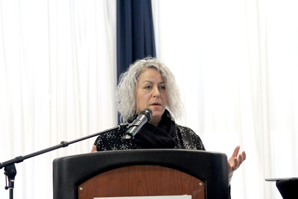
Travel Manitoba president Colin Ferguson said the objective was to highlight what makes the city unique. In Brandon’s case, the goal was to attract conventions and major events. It is also meant to bring people back after first visiting for one of these major events, such as the recent Tim Hortons Brier or the Royal Manitoba Winter Fair.
The logo takes inspiration from the natural environment of Brandon and the landscape the city is built in, McKim Communications Group executive vice president Audra Lesosky said.
At team at McKim Communications Group was behind Brandon’s fresh branding.
“Beyond the physical features, we knew we needed to draw from the character of this place, and one of the creative thought-starters was the idea of connection you see … when people come together here.”
The brand can also be used to boost economic growth.
“(Brandon) needed a refreshed brand and some tools in order to accelerate that growth, and we heard in the Brandon sessions that ‘All we have to do is get people here and they will get it,’ so when they know what this place has to offer, they will return again and again.
Brandon also represents the “duality” between a small town and big city and offers the best of both types of community and is something the city can take advantage of, Lesosky said.

Mayor Rick Chrest said he thinks the new logo and tag line hit at the heart of the city and what it’s like to live here.
“We all know that when people get transferred here or they come for a convention … then they do get it. They often get dragged in here kicking and screaming when they’re transferred in and then they have to be dragged out kicking and screaming because they don’t ever want to leave.”
Sandy Trudel, City of Brandon director of economic development, said while the logo is meant to be a tourism brand, it will also become a community brand that can be adopted by different organizations.
“What we need now is to have people look at their organization. It doesn’t matter whether they’re a restaurant, an event, a destination or an attraction, they can incorporate this concept of bringing you back because it’s speaking to the experience they’ll deliver.”
At the economic development office, Trudel said the “Brandon Brings You Back” logo could be used to draw people back to the city.
“If you think about the concept of ‘Brings you Back,’ it fits beautifully in with relocation, so we know our people may leave, they may explore and this message resonates with those coming back.”
Chrest said he also sees the new brand as being useful so close to Manitoba 150 in 2020, when people will be taking a closer look at the province they live in.
“Right on the eve of our Manitoba 150 celebration we’ll be ready with a hot new look and a hot new statement and just a great community full of people who are prepared to greet people, we’re going to be an entire city standing to greet you.”
» dmay@brandonsun.com
» Twitter: @DrewMay_