Chargers unveil updated lightning bolt and logotype
Advertisement
Read this article for free:
or
Already have an account? Log in here »
We need your support!
Local journalism needs your support!
As we navigate through unprecedented times, our journalists are working harder than ever to bring you the latest local updates to keep you safe and informed.
Now, more than ever, we need your support.
Starting at $15.99 plus taxes every four weeks you can access your Brandon Sun online and full access to all content as it appears on our website.
Subscribe Nowor call circulation directly at (204) 727-0527.
Your pledge helps to ensure we provide the news that matters most to your community!
To continue reading, please subscribe:
Add Brandon Sun access to your Free Press subscription for only an additional
$1 for the first 4 weeks*
*Your next subscription payment will increase by $1.00 and you will be charged $20.00 plus GST for four weeks. After four weeks, your payment will increase to $24.00 plus GST every four weeks.
Read unlimited articles for free today:
or
Already have an account? Log in here »
Hey there, time traveller!
This article was published 24/03/2020 (2213 days ago), so information in it may no longer be current.
LOS ANGELES – The Los Angeles Chargers have updated their logo and unveiled new logotype ahead of their move into their new home.
The franchise is keeping the lightning bolt as its primary logo, but it has become sleeker and streamlined. There is not as much of a curve to the bolt, while navy blue has been removed as one of the colours. Powder blue and sunshine gold remain as the predominant colours.
The Chargers have also added a bolt to the “A” in their nickname in the logotype. The font is more italicized and has been made bolder.
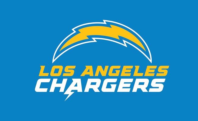
“With words becoming increasingly interchangeable with emojis and acronyms, the team decided to build a bolt emoji into its new logotype,” the team said in a release. “While it’s not easy to reflect a vibe in logos and uniforms, the team set out to do just that with a bold, vibrant, electric and fun brand update.”
The Chargers’ changes aren’t as bold or dramatic as the Rams, who revealed their new logo Monday. The Rams have switched to a primary logo that features an “LA” with a ram’s horn curved around the letters.
Both teams are updating their look in conjunction with the opening later this year of SoFi Stadium in Inglewood, California. The Rams and Chargers unveiled their logos on social media and their websites, instead of doing presentations because of the coronavirus pandemic.
The Chargers will also unveil new uniforms in mid- to late-April. Both LA teams are part of seven franchises making either logo or uniform changes or additions during the off-season. Normally there are only two or three.
___
More AP NFL: https://apnews.com/NFL and https://twitter.com/AP_NFL